
Do you wonder why people don't seem to be impressed with your presentations? Do you see people in the audience nodding off or busily texting their friends instead of paying attention to what you are saying? Want to make sure your audience gets your message? This post provides some answers to these questions.
I took a break from working on my presentation “Rise to the Occasion: How to Design, Prepare, and Deliver Outstanding Presentations” to go hear a series of talks given by graduate students.
Let me preface my comments by stating that these and most student presentations I hear these days are far superior to the ones I gave while in graduate school. So my comments are meant to be constructive, not dismissive.
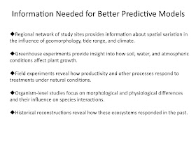
The main thing I noticed today (and this is a trend I’m seeing more often) is that the students crammed a lot of information onto their PowerPoint slides—information that they then repeated verbally. Although none of the students in today’s seminar read their slides verbatim, I’ve seen this done on a number of occasions (and students are not the only ones who do this). Inexperienced speakers use this approach as a crutch because they are nervous and having the information on the slide is a safety net in case they forget. Also, they tend to put more information on a single slide, in an attempt at brevity.
But by having the information written fully on the slides prompts the audience to try to simultaneously read and listen to what the speaker is saying. There are several problems with this.
One is that people can read faster than the speaker can speak, so that the audience has already read the message and then has to listen to it repeated by the speaker. This translates into a boring presentation, and the audience’s attention wanders (perhaps when you are trying to make your most important point). If the slide contains a long list of items, each several lines long, the audience then goes into a brain lock trying to reconcile what they are reading and what they are hearing.
What is the solution? The best solution is to use a photograph, diagram, or other graphic (uncomplicated) to illustrate the point to be made; then explain the point verbally. If the point is one that is not easily represented visually, then a single word or short phrase suffices to focus attention and serve as a reminder without giving away what the speaker will say about the point. If you have several points to make, introduce them one at a time using the custom animation function in PowerPoint or split information across several slides.
A combination of visual examples, short text, and animation gives your audience everything they need to follow your line of reasoning, especially complex concepts, methods, or findings.
In the example above, I show how information is typically presented as a bulleted list (top slide). In contrast, the second slide gives the same information, but the points are illustrated with photos and diagrams from earlier in the talk. There is a brief text with each illustration, which the speaker then elaborates upon verbally. By presenting information this way, you link back to information presented earlier and also connect with both visual and auditory learners in the audience. Even kinesthetic learners can more readily understand by seeing a photo of someone carrying out an activity.
One of the students actually used this technique very well. Her topic was one that might have been difficult to follow, but her slide design and delivery made it easy to understand (and remember) her points. She broke down the information into understandable bites and introduced them gradually, using lots of illustrations and photos. As I write this, I can easily recall her talk, most of her slides, and what her main points were. The other students all used slides with long bulleted lists of information. I can’t remember anything significant about their research and would have to really concentrate hard to remember what their overall goals were.
The main take-home message today is: DON’T MAKE YOUR AUDIENCE WORK TO UNDERSTAND YOUR PRESENTATION
No comments:
Post a Comment