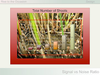
 Another design concept to consider when composing your slides for a presentation is the "signal to noise ratio".
Sometimes, we try to make our slides more interesting by having lots of colors in the graph bars or use a photograph as a backdrop, but this increases the noise signal and hides the main point (our data). The example to right is an exaggeration, of course, but it makes the point that you should include only those elements that help with understanding the slide.
Here is the same information from the slide above presented in a cleaner, simpler style. I've even removed the axes, which are not really needed. You can include a photo to emphasize a particular data point. The whole point is to minimize the clutter and to include only those elements necessary to get the audience to focus on the key result.
There are also different ways to combine text and images. The example to the right illustrates one way, which is OK, but not that memorable. There is a quotation, which is the focus of the slide. The photo does a good job of illustrating the quotation--a woman sitting by the water passively waiting. The meaning of the saying is that you should not sit around waiting for things to come to you; you should get out there and make things happen. But we can do better with the composition.
Another way to combine text with an image is to place the text within a larger version of the image. When this is done, as in the example to left, the emphasis is on the quotation, and the photo supports the point being made in the quote. This photo works because there is plenty of space to accommodate the text box. I've also made the background of the text box slightly transparent, so that the water behind can be seen.
There are other ways to combine text/data with images that are effective--so be creative!


No comments:
Post a Comment